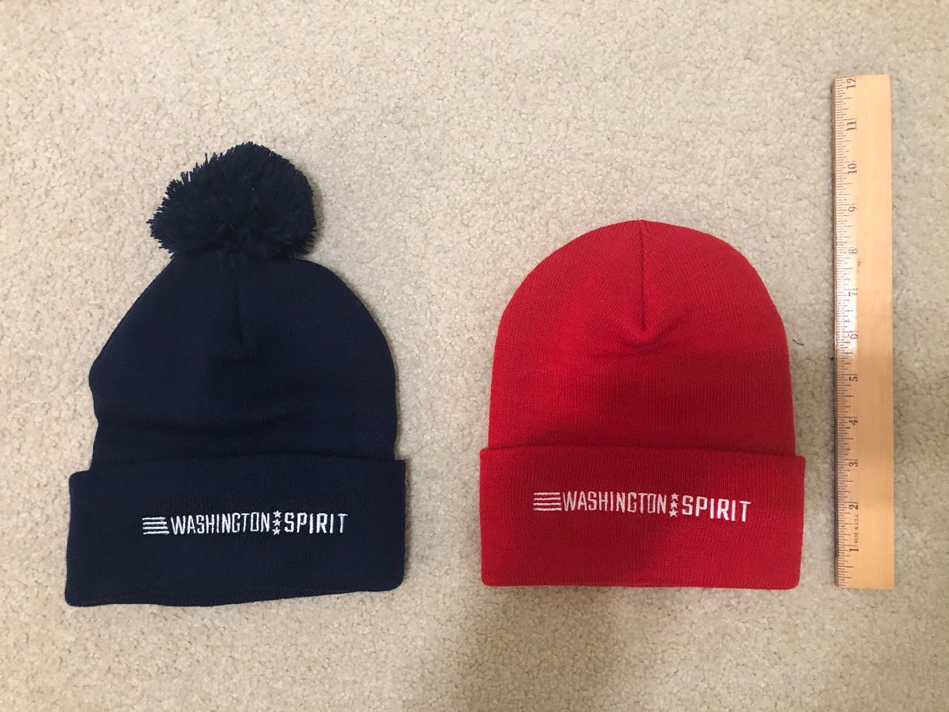
The stars and bars together suggest the American flag and our close ties with our home city of Washington, DC. The three stars tie back to the DC flag as well. We originally had three lines in the leader section, but that was too close in appearance to the Adidas logo, and would definitely be a problem with Nike being the league sponsor.
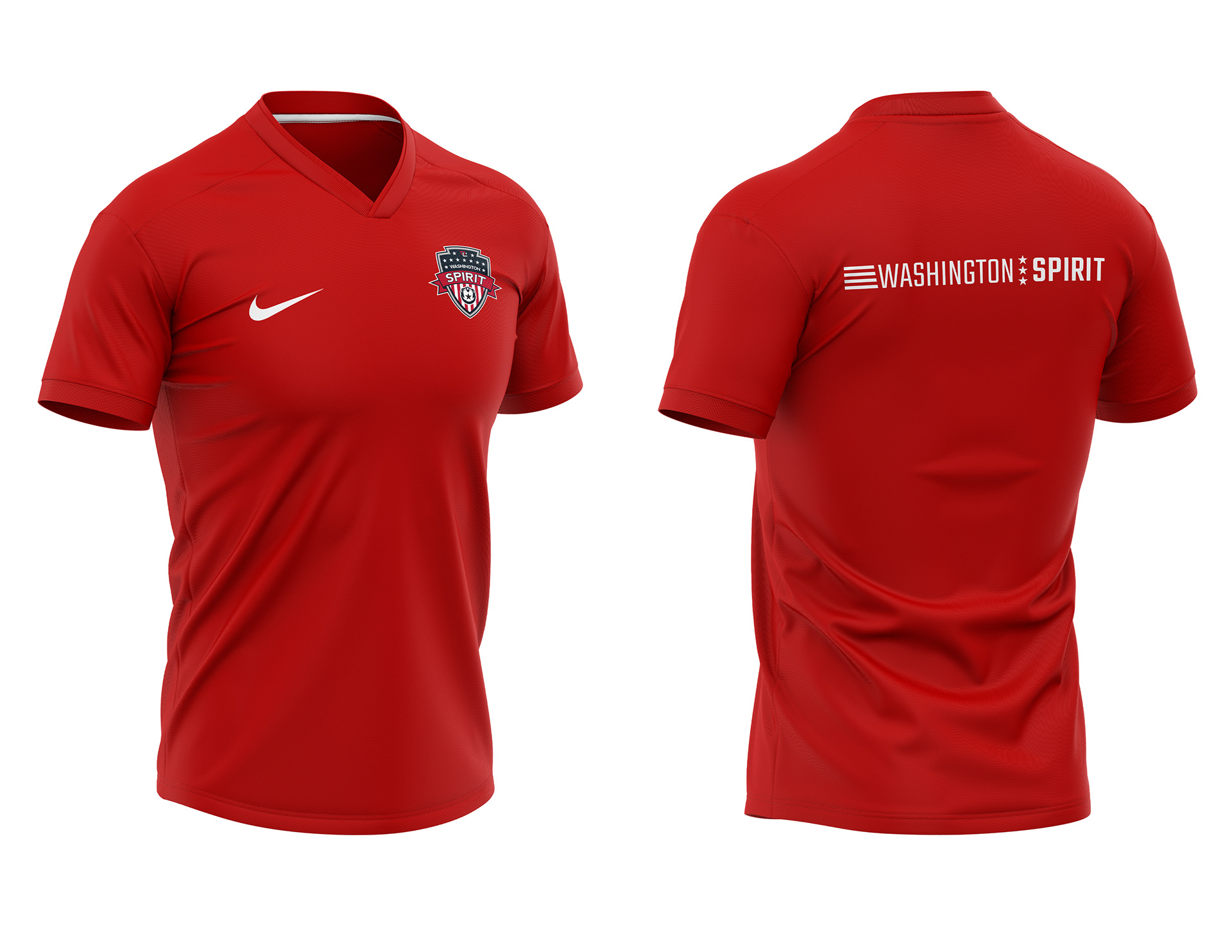
This work also cemented our use of the typeface Teko, which has great weight flexibility for our designs and a number/letter feel that fits the professional sports brand as well as the club's direct and assertive style.
It wasn't terribly complex in execution, but required a lot of organizational coordination and approval. Of all the work I've done at the club to date, this one I'm particularly proud of. It's a perfect example of design solving a problem.